Revenue CHART
Ambarella (AMBA) — Revenue
Fundamental data and historical chart analysis for Ambarella — powered by Stock Traders Daily research.
AMBA Revenue Chart
Updated daily
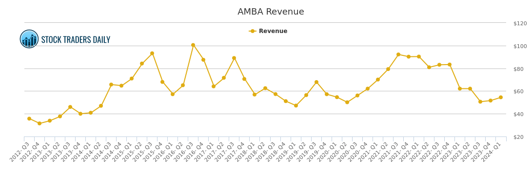
What is a Revenue Chart?
A revenue chart displays a company's total sales over time, also known as the top line. Revenue represents the total amount of money a company brings in from its business activities before any expenses are deducted.
Why Does It Matter?
Revenue growth is the foundation of long term earnings growth. A company can temporarily boost profits through cost cutting, but sustainable earnings growth ultimately requires growing revenues. Consistent revenue growth indicates strong demand for a company's products or services.
How to Read the Chart
A steadily rising revenue line indicates the business is expanding its sales base over time. Accelerating revenue growth — where the rate of increase is itself increasing — is often viewed very positively by investors. Flat or declining revenue raises questions about market saturation, competition, or weakening demand.
What Influences Revenue?
Revenue is driven by unit volume, pricing power, new product launches, geographic expansion, acquisitions, and broader economic conditions. Seasonal businesses may show significant quarter to quarter variation, making the year over year comparison most meaningful.
Past Coverage
News & Analysis — AMBA
July 17, 2026
Avoiding Lag: Real-Time Signals in (AMBA) Movement
Read article →
July 05, 2026
Avoiding Lag: Real-Time Signals in (AMBA) Movement
Read article →
June 24, 2026
Discipline and Rules-Based Execution in AMBA Response
Read article →
June 13, 2026
Behavioral Patterns of AMBA and Institutional Flows
Read article →
June 02, 2026
(AMBA) Movement Within Algorithmic Entry Frameworks
Read article →
May 22, 2026
How (AMBA) Movements Inform Risk Allocation Models
Read article →
May 11, 2026
Trading Systems Reacting to (AMBA) Volatility
Read article →
April 30, 2026
How Ambarella Inc. (AMBA) Affects Rotational Strategy Timing
Read article →
April 19, 2026
(AMBA) and the Role of Price-Sensitive Allocations
Read article →
April 08, 2026
Responsive Playbooks and the AMBA Inflection
Read article →
March 28, 2026
Understanding the Setup: (AMBA) and Scalable Risk
Read article →
March 17, 2026
The Technical Signals Behind (AMBA) That Institutions Follow
Read article →
March 06, 2026
Precision Trading with Ambarella Inc. (AMBA) Risk Zones
Read article →
February 23, 2026
Technical Reactions to AMBA Trends in Macro Strategies
Read article →
February 12, 2026
Trading the Move, Not the Narrative: (AMBA) Edition
Read article →
Our Specialized Tools
Institutional-Grade Research
Risk Control
Evitar Corte
Protection from market crashes. We help investors identify every crash since 2000, in advance, using our proprietary model.
Learn more →
Macro Indicator
The Investment Rate (IR)
A measure of natural liquidity. The IR identified the bookends of every long-term stock market cycle since 1900.
Learn more →
Strategy
Investment Approach
With a macro foundation, we offer actionable investment strategies that allow clients to make money in any market environment.
Learn more →